Train stations are built for motion, not meandering. That makes them a perfect fit for the next wave of cashierless store design: a compact, high-trust souvenir kiosk that lets travelers grab a city-themed gift, pay instantly, and keep moving. The real challenge is not just installing hardware; it is creating a retail system that survives rush-hour crowding, unpredictable dwell times, international payment preferences, and the unique theft and replenishment risks of station retail. If you want a model that actually works at a terminal, you need to think like an operator, a merchandiser, a transit planner, and a UX designer at the same time.
This guide is a practical blueprint for building a computer vision or RFID-enabled kiosk that supports frictionless shopping, queue-free retail, and last-minute purchases without turning the station into a tech demo. It draws on broader smart retail trends, including the rise of autonomous stores and contactless payments highlighted in the smart retail market outlook, while translating those ideas into station-specific choices. If you are building around transit destinations, you may also want to pair kiosk placement with landing pages that capture nearby buyers and route-conscious travelers who are already searching for what to buy before they board.
1) Why Train Stations Are the Perfect Use Case for Cashier-less Souvenir Retail
High intent, short dwell time
Train station shoppers are different from mall shoppers. They usually arrive with a specific time constraint, a travel mood, and a strong bias toward convenience. That means your product assortment should emphasize easy-to-understand items that can be bought in under 90 seconds, such as prints, postcards, magnets, lapel pins, compact books, and lightweight collectibles. The best station kiosk is not trying to become a department store; it is capturing a moment of urgency and converting it into a simple, memorable purchase.
This is exactly where the smart retail trend toward autonomous checkout fits the station environment. Smart retail systems eliminate checkout queues, and the underlying logic is stronger in transit than almost anywhere else because every second matters. For an operator, the design goal is to make the kiosk feel like an extension of the station flow, not a disruption to it. Think of it as retail infrastructure, much like ticket gates or wayfinding signage, but with emotional value layered in through local storytelling and destination-themed merchandise.
Souvenirs as impulse products, not browsing products
In station retail, souvenirs are best treated like time-sensitive impulse buys. Travelers often want proof they were there, a gift for someone waiting at home, or a small object that turns a transit memory into something tangible. That makes city posters, transit diagrams, and limited-edition prints especially effective, because they can be understood visually in a split second. If your assortment feels too broad or too generic, customers will walk past without stopping.
Operators can learn from product curation strategies used in other collector-driven categories. For example, the logic behind building a collection that lasts applies neatly here: focus on items with recurring demand, strong visual identity, and a clear story. Station kiosks should avoid overloading the display with SKU clutter. A traveler needs confidence, not choice overload.
Transit environments reward operational simplicity
A train station is a controlled but demanding environment. There are peak surges, platform changes, noise, weather exposure, and a wide mix of customers from commuters to tourists to rail fans. The kiosk design has to survive all of that while staying self-service. That usually means fewer moving parts, fewer steps, and fewer opportunities for confusion. Every added tap, scan, or modal screen increases abandonment risk when the customer has a departure to catch.
For location strategy, it helps to think the way hospitality operators think about visibility and nearby demand. The principles behind improving local search visibility and the traveler intent captured in trip-based experience planning are relevant because station retail works best when the offer aligns with what travelers are already seeking at that moment: a keepsake, a gift, or a useful item tied to place.
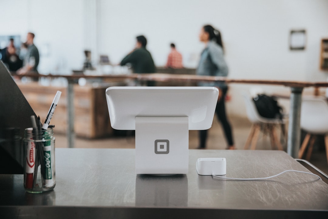
2) Choosing the Right Technology Stack: Computer Vision, RFID, or Hybrid
Computer vision for high-throughput, hands-free experiences
Computer vision is the most intuitive path for a cashier-less kiosk because it can detect item picks and returns without requiring every product to be individually scanned by the shopper. In a compact souvenir kiosk, this works best when products are structured clearly on shelves, each with distinct shapes, colors, and shelf positions. The system uses cameras, shelf mapping, and AI inference to identify what was removed and what was put back. The benefit is speed: a traveler can grab a magnet or poster tube and pay on the way out without a traditional checkout interaction.
That said, computer vision performs best when your merchandising discipline is strong. If your stock is visually too similar or poorly lit, the system can struggle. A good station kiosk therefore needs strict planograms, consistent packaging, and a lighting design that minimizes glare and shadow. The concept of running inference at the edge versus the cloud, explained in retail ML deployment patterns, matters here because station kiosks often need sub-second decisions with intermittent connectivity.
RFID for precision, speed, and low-friction inventory control
RFID is especially attractive for souvenirs because many items are packaged, small, and easy to tag before deployment. Each item receives a tag that can be read at shelf or exit, making inventory management more predictable and reducing false positives. RFID is often the better choice for higher-value items, limited editions, and fragile goods where a precise count is essential. It also supports easier replenishment because staff can verify stock instantly with handheld readers.
The tradeoff is cost. Tagging every SKU adds supply-chain complexity, and you need to manage tamper resistance and tag placement so they don’t interfere with the product itself. For collectible or premium items, however, that tradeoff is usually worth it. If the kiosk includes exclusive city prints or limited-run releases, RFID can protect margin and shrink the risk of miscounts. The same collector logic applies in collector-restoration markets where product authenticity and condition drive buyer trust.
Hybrid systems often work best in stations
For most train-station deployments, the strongest answer is a hybrid model: computer vision for customer flow and basket tracking, RFID for high-value or hard-to-recognize items, plus weight sensors or shelf checks as a backstop. This layered approach reduces error rates and gives operators a fallback if one signal degrades. It also makes shrink investigations easier because you can reconcile multiple data streams instead of relying on a single source. In a dense environment, redundancy is not overengineering; it is survival.
Operators should also design around data integrity and governance. Retail AI systems are only useful when the underlying signals are trustworthy, which is why the risk management mindset from data integrity and AI threats and the auditing approach in AI governance gap assessment should inform your launch checklist. If you cannot explain how the kiosk knows what a customer took, you are not ready to scale.
3) Product Selection for Hurried Travelers
Build the assortment around “grab-and-go memory objects”
The best souvenir kiosk assortment is built around what I call memory objects: items that are small, legible, and emotionally tied to place. Think subway map posters, local line diagrams, station-name prints, enamel pins, compact notebooks, postcards, keychains, and travel-friendly art prints in standard sizes. These items work because they can be understood in under five seconds and purchased without deliberation. They also lend themselves to a visually organized display, which is critical for cashier-less systems.
To keep the offer coherent, it helps to create three tiers: entry gifts under a modest impulse-buy price, mid-tier collectible items, and premium limited editions. This mirrors the pricing logic in fast repricing scenarios, where clear price bands keep customers from stalling. Station retail should make it easy to answer the question, “What can I buy in 30 seconds for under X?”
Prioritize products that photograph well and tell a city story
In a train station, visual communication is everything. If the traveler can understand the item from three feet away, your conversion odds rise sharply. That is why graphic posters, route maps, typographic prints, and landmark-based visuals outperform obscure merchandise. People buy the story as much as the object, especially when they are leaving the city and want something that condenses the trip into a single image.
To strengthen that story, use destination-specific creative systems similar to the way lifestyle brands manage collaboration and visual identity in visual identity pairing. The poster, the tag, the packaging, and the kiosk screen should all say the same thing: this is a curated city object, not generic retail filler.
Don’t ignore packaging and carryability
Travelers are extremely sensitive to awkward packaging. If the item needs a bag, a corner protector, or a tube, those supports should already be integrated into the kiosk workflow. Poster tubes, rigid sleeves, and compact carry bags reduce friction and improve perceived quality. Packaging is also part of theft prevention: a securely packed item is easier to track, harder to conceal, and more likely to survive a hectic commute.
For product mix inspiration, look at how high-value collectible categories benefit from tight assortment strategy, like the way tech drops become memorabilia in collectible product launches. A station souvenir kiosk can create the same energy if the product feels intentionally limited, local, and worth carrying through a terminal.
4) User Experience Design for Travelers in a Hurry
Design for one-handed, one-minute shopping
Travelers often shop with one hand, one eye on a departure board, and one ear on station announcements. Your UX must respect that reality. Large category labels, one-tap add-to-basket behavior, and a concise payment flow are non-negotiable. The ideal experience is: notice, choose, pay, leave. If the interface demands account creation, multi-step checkout, or long product descriptions, conversion will collapse.
Wayfinding and microcopy should be extremely short and universal. Use plain language like “Take item,” “Pay on screen,” and “Done in under 30 seconds.” If you need to explain the technology, do it only after purchase or through a help screen. The customer’s primary job is to catch a train, not learn your operating model.
Make the kiosk readable from a distance
Station shoppers decide from afar whether to stop. That means large category headers, strong visual hierarchy, and lighting that makes premium items sparkle without creating reflections. Posters and prints should be mounted at eye level, while smaller products should sit in well-lit modules with clear price markers. If the kiosk is too visually dense, it becomes background noise.
There is a useful analogy here to design-for-impact frameworks used in other consumer environments, such as translating aspirational looks into everyday wear. In both cases, the trick is making something desirable but not intimidating. The kiosk must feel accessible, not museum-like.
Build for stress, interruptions, and multilingual users
Train stations are multilingual, multiscreen, and often stressful. Your kiosk should support large touch targets, language toggles, fast error recovery, and receipts that work across email, SMS, or QR delivery. If the shopper gets interrupted by a train announcement, they need to be able to resume instantly without starting over. The best cashierless interfaces reduce cognitive load rather than adding features.
Where possible, test the flow with actual station travelers, not just staff. UX validation in a transit terminal should include people in a hurry, people with luggage, and people using mobile wallets under bright lighting. Good station retail feels effortless because it is designed around disruption, not ideal conditions.
5) Anti-theft, Loss Prevention, and Trust Without a Cashier
Use layered verification, not just one “magic” system
Cashierless retail succeeds only when loss prevention is built into the architecture. In a souvenir kiosk, that means combining shelf sensing, exit validation, exception alerts, and store-enclosure controls. Computer vision alone can miss edge cases; RFID alone can be fooled by tag issues; weight sensors alone can drift. The best approach is multi-signal verification that flags anomalies without slowing honest shoppers.
Security design should also stay visually calm. Customers should not feel like they are being treated as suspects. Good anti-theft design is almost invisible: tight physical layout, clear sightlines, secure access panels, and smart alarm rules. For guidance on safeguarding inventory and detecting counterfeit risk, the principles in AI-based fake detection are useful because they emphasize pattern recognition, confidence thresholds, and human review for exceptions.
Limit shrink through assortment and placement
Not every product belongs in a cashierless kiosk. The more high-value, tiny, or easy-to-pocket the item, the more your shrink risk rises. That is why premium merchandise should either be RFID-tagged or placed in a locked, controlled-access zone. Smaller impulse goods can live in open displays if the system is accurate enough and the packaging makes concealment difficult.
It also helps to use station-aware assortment logic. Items closer to exits, platform approaches, and high-flow corridors should be lighter, lower-risk, and easier to verify. Premium items can still sell, but they should occupy locations with stronger camera coverage and better operator visibility. This is a retail version of traffic engineering: move the safest, simplest transactions to the highest-speed lanes.
Trust is part of the product
Travelers are more likely to buy if they trust the kiosk. Visible payment confirmation, clear refund language, and obvious support paths matter a lot. A shopper who is rushing is also more sensitive to the fear of being double-charged or unable to prove purchase. Make receipts easy to retrieve and customer support easy to contact, especially for international travelers who may not want to call a local number.
This trust layer should be treated as product design, not back-office administration. The broader case for responsible AI adoption in retail, discussed in responsible AI and trust dividends, shows that transparent systems build retention. In station retail, trust can be the difference between an impulse purchase and a walk-away.
6) Integrating Contactless Payments with Station Ecosystems
Support the payment methods travelers already use
A station kiosk should accept contactless cards, mobile wallets, QR-based payments where relevant, and ideally local transit payment rails if the station operator permits. The goal is to reduce friction by matching what the traveler already has in hand or on their phone. If a system only accepts one payment method, you are effectively forcing a language barrier into the checkout process.
Payments should be fast, but they also need to be reconciled cleanly with the kiosk’s product event logs. That means each basket should map to a specific transaction ID, timestamp, and device record. This reduces chargeback disputes and helps operators investigate anomalies after rush periods. Smart offices and compliance frameworks offer useful lessons here, especially the balance described in smart compliance design.
Connect the kiosk to station payment journeys
Some stations already run unified payment environments for food, lockers, parking, or transit add-ons. If your kiosk can plug into that ecosystem, the customer experience becomes much smoother. Consider preauthorized payment tokens, guest checkout with rapid authorization, or a station app that can recognize kiosk inventory and let customers buy before they arrive. That is how you move from simple retail to integrated station commerce.
When paid flows are connected to broader travel behavior, the kiosk can capture more last-minute demand. For example, travelers planning short-hop trips often combine arrival logistics and shopping decisions in the same session. That resembles the structured booking behavior explored in multi-city travel planning, where friction reduction directly influences conversion.
Handle failed payments without creating a bottleneck
Nothing kills queue-free retail faster than a stalled transaction. The kiosk must have a graceful fallback if a card fails, a wallet does not authenticate, or a traveler loses connectivity. That means clear retry steps, alternate payment options, and a visible “help” or remote support path that does not require a human cashier. If the platform is down, the kiosk should default to safe lockout rather than ambiguous partial purchases.
Operationally, this is where transaction observability matters. You should monitor authorization rate, payment latency, failed payment causes, and the percentage of abandoned baskets. These metrics tell you whether the station environment is helping or hurting conversion. Without them, you are guessing at the very moment when speed matters most.
7) Operations Blueprint: Replenishment, Maintenance, and Staffing
Run the kiosk like a micro-fulfillment node
A successful cashierless souvenir kiosk is basically a tiny fulfillment center with a face. Replenishment should be planned by time of day, train schedule, event calendar, and tourist season. Peak windows near morning departures, evening arrivals, and weekend tourism surges will likely require more frequent stock checks. Refill tasks should be short, standardized, and possible without shutting down the whole unit.
The best operating rhythm borrows from small-footprint retail models and limited-capacity pop-ups. The logic in high-impact limited-capacity pop-ups applies because a small format can perform well when every square foot is assigned a job. Operators should track sell-through by SKU, shelf dwell time, and incident frequency to keep the assortment fresh and profitable.
Maintenance must be designed for the station environment
Train stations create dust, vibration, crowd pressure, lighting variation, and occasional weather exposure if the kiosk sits near entrances. Cameras need cleaning schedules, RFID readers need calibration, and enclosures need regular checks for wear. If the kiosk has a glass front or screen interface, fingerprint buildup can quickly make the whole experience look neglected. A kiosk that looks broken loses trust even if the system still works.
Edge devices should be mounted with security and service access in mind. If a camera fails or a reader drifts, your ops team should be able to swap modules fast. That kind of modularity is similar to asset management strategies discussed in asset orchestration for changing product lines, where flexibility prevents the stack from breaking when SKUs or hardware assumptions change.
Staff the exception, not the routine
Cashierless does not mean staffless. The smartest model uses one operator to handle exceptions, restocking, cleaning, and customer rescue during peak periods. Rather than stationing a cashier at a register, assign a roving attendant who can answer product questions, intervene in failed payments, and help travelers who are unfamiliar with the format. This keeps labor focused on the tasks that computers still struggle with.
The broader lesson from deskless-workforce management is that frontline environments need clear SOPs, quick escalation paths, and realistic scheduling. Good context on this comes from deskless worker readiness and aviation-inspired safety protocols, both of which emphasize process discipline in high-pressure environments. In a station kiosk, the human role is about resilience, not cashiering.
8) Merchandising, Pricing, and Limited Editions That Drive Conversion
Use scarcity the right way
Limited editions work exceptionally well in station retail because travelers respond to “available here, now, and maybe not later.” The key is to make scarcity believable and meaningful, not gimmicky. Numbered runs, city-specific series, and seasonal station releases give customers a reason to buy immediately. If the kiosk offers exclusive prints tied to local transit history, the item becomes both a souvenir and a collectible.
To avoid confusion, label editions clearly and keep the production story simple. This mirrors how collectors value transparent release structures in products like limited-edition phones or niche memorabilia. The more concrete the run size and theme, the easier it is for customers to say yes.
Price for speed, not negotiation
Station retail is not a place for complex pricing ladders. Use crisp price points and bundled offers that reduce decision time. A postcard plus pin bundle, or a print with a protective sleeve included, can simplify the choice while increasing average order value. Price transparency matters even more in cashierless environments because the shopper cannot rely on a cashier to explain what they are buying.
If tariffs, import costs, or supply shifts affect your product mix, update price displays quickly and consistently. The operational lesson from repricing under pressure is that slow price updates damage trust. In station retail, stale price tags are especially harmful because customers are already moving fast.
Test assortment like a portfolio
Not every souvenir concept deserves full-scale deployment. Treat SKUs like a portfolio: some are stable sellers, some are seasonal, and some are experimental. You should track conversion rate, shrink, margin, and repeat purchase potential by item group. A smart kiosk is constantly pruning weak performers and rotating in stronger city stories.
That portfolio mindset is also used in categories like collectibles and media bundles, where data separates fads from enduring favorites. The framework in bundled classics and value prioritization is a useful analogy: package value in a way that fits the buyer’s time and budget, but don’t overload the shelf with speculative items.
9) Measurement, Analytics, and Store Optimization
Track the metrics that matter in transit retail
For a cashierless kiosk, the important metrics are not just sales. You need dwell time, conversion rate, basket size, payment success rate, stockout frequency, shrink, and exception alerts by hour. Because the customer window is short, even small improvements in speed can produce large gains. The station environment also creates a strong need for daypart analysis so you can align stock with the rhythms of commuters and travelers.
Smart retail is increasingly built around data-driven decisions, and that broader market is growing rapidly because retailers want better automation and visibility. The same market forces that support autonomous stores in the smart retail market forecast are what make station kiosks viable now. If you can measure the journey clearly, you can improve it quickly.
Use experiments to refine layout and messaging
A/B testing is not just for web pages. In a kiosk, you can test category order, lighting warmth, poster orientation, promo copy, and bundle placement. For example, placing destination prints at eye level versus placing them near the exit may materially change conversion because the shopper’s attention shifts with flow direction. Every change should be measurable and linked to a hypothesis.
If your analytics team is building multi-layer reporting, it can help to think in terms of buyable signals rather than raw impressions, similar to the pipeline logic described in AEO impact measurement. In station retail, a gaze does not pay the bills; a completed transaction does.
Build feedback loops into the operations cycle
The best kiosk operators create tiny feedback loops: daily replenishment notes, weekly anomaly reviews, monthly assortment cuts, and seasonal theme refreshes. These loops prevent the kiosk from drifting into stale inventory or invisible failure modes. You want staff to notice patterns early, not after the station floor has already absorbed the loss.
That mindset is closely related to creating supportive, responsive environments in other content systems, like the methods described in community engagement frameworks. In retail terms, support means the store listens, adapts, and stays useful.
10) Launch Checklist, Risks, and a Practical Rollout Path
Start with a narrow pilot
Do not launch a full multi-station network first. Start with one station, one kiosk, and one carefully chosen assortment. Test commuter-heavy hours, tourist spikes, payment mix, and physical wear patterns. A pilot gives you the chance to see how customers actually behave instead of how you hope they will behave. It also helps you establish the right replenishment cadence before the model scales.
If you want to maximize launch momentum, combine the pilot with local destination content and search visibility, similar to the tactics in local landing-page strategy and the broader distribution thinking behind snackable content repurposing. Travelers often search before they arrive, and the kiosk should already feel familiar when they step into the station.
Plan for the real risks
The biggest risks are false detection, payment failure, awkward UX, stockouts, and shrink. Secondary risks include signage confusion, device downtime, and poor lighting in the station environment. You should also expect some customers to distrust the technology at first. The answer is not to oversell the system; it is to make it visibly reliable through clear design and consistent outcomes.
Where safety and resilience are involved, borrow from highly regulated operational fields. The practical discipline found in aviation safety protocols is a strong model for incident logging, process checklists, and escalation behavior. In a train station, every operational mistake is seen by thousands of people, so the system needs to be boring in the best possible way.
Scale only after your unit economics are proven
Once the kiosk is stable, evaluate whether the model can scale across stations with different passenger profiles. Some sites will be commuter-heavy and price-sensitive, while others will be tourist-heavy and collector-friendly. The product mix, pricing, and payment emphasis should adapt accordingly. Scaling a kiosk is less about copying hardware and more about copying the decision system that makes the hardware profitable.
When you are ready to widen distribution, remember that product curation and supply management should stay tight. The same discipline that helps creators build systems that scale without rework is what keeps a retail kiosk from becoming operationally messy. Keep the stack lean, the assortment sharp, and the traveler experience fast.
Comparison Table: Computer Vision vs RFID vs Hybrid for Station Souvenir Kiosks
| Approach | Best For | Strengths | Limitations | Station Fit |
|---|---|---|---|---|
| Computer Vision | Fast grab-and-go shopping | Minimal shopper friction, strong UX, scalable basket tracking | Needs great lighting and disciplined merchandising | Excellent for open-display, low-complexity kiosks |
| RFID | Tagged souvenirs and collectibles | Precise item identification, strong inventory control, easier auditing | Tag cost, tagging workflow, reader setup complexity | Great for premium and limited-edition items |
| Hybrid CV + RFID | Busy stations with mixed SKUs | Redundancy, better anomaly detection, higher trust | Higher integration cost and more operational tuning | Best overall for most transit environments |
| Weight Sensor Backstop | Validation and exception handling | Simple verification layer, useful for drift detection | Less precise for varied product mixes | Strong as a secondary control |
| Contactless-Only Checkout | Ultra-light kiosks | Low hardware complexity, fast payment flow | Requires self-scanning and more shopper effort | Useful when staff or tech budgets are limited |
FAQ
Is a cashier-less souvenir kiosk realistic in a crowded train station?
Yes, if the kiosk is designed for short dwell times, clear assortment, and layered verification. The busiest stations are actually strong candidates because convenience is already the dominant behavior. The key is keeping the UX simple and the physical layout highly legible.
Should I choose computer vision or RFID first?
If your assortment is visually distinct and you want the smoothest shopper experience, start with computer vision. If you sell many premium, small, or limited-edition items, RFID may be the better control layer. Most station deployments benefit from a hybrid approach.
How do I reduce theft without making the kiosk feel locked down?
Use multi-signal monitoring, secure display design, and clear pricing rather than obvious deterrence theater. Customers should feel the kiosk is trustworthy, not hostile. Good anti-theft design is subtle and operationally strong.
What products sell best in station souvenir kiosks?
Compact, visually clear, carryable items do best: posters, prints, postcards, pins, magnets, notebooks, and limited-edition city collectibles. Items should be understandable in seconds and easy to carry onto a train.
How do I handle international travelers with different payment preferences?
Support contactless cards, mobile wallets, and, where possible, local transit-compatible payment methods. Clear on-screen instructions, multilingual support, and fast receipts reduce confusion. The smoother the payment path, the more likely the traveler is to buy before boarding.
What is the most common mistake in cashier-less station retail?
Overcomplicating the experience. Operators often add too many SKUs, too many steps, or too much tech explanation. The winning kiosk behaves like a clean, intuitive shortcut for a traveler who is already in motion.
Related Reading
- Crafting Ambassador Campaigns: Align Visual Identity with Influencer Pairings - Learn how strong visual systems drive instant recognition.
- The Headphone Drop That Doubles as Memorabilia - See how collectible drops create urgency and scarcity.
- Spotting Fakes with AI - A useful lens for authentication and risk control.
- Small-Scale, High-Impact: Designing Limited-Capacity Live Meditation Pop-Ups That Convert - A smart model for compact, conversion-focused formats.
- The Trust Dividend - Why responsible AI design can increase retention and confidence.
